
Technology
How Startup Teams Can Stop Guessing and Start Designing Better User Journeys


Start With the Journey That Blocks Growth
Startup UX work often starts too late, after signups stall or paid users leave without warning. A small team may add screens, rewrite buttons, or change colors while the real issue sits in the path between intent and action. Better user journeys begin with one focused question: where does the product ask too much from the user too early? That question keeps the team close to behavior, not opinions. It also makes design work easier to discuss during short product meetings.
Study Real Flows Before Drawing New Ones
A small product team does not need to invent every onboarding, checkout, login, or retention pattern from scratch. Real products have already tested many choices that early teams are still debating in Slack. Reviewing Page Flows gives founders and product teams a practical way to study real user flows, screen sequences, and interface decisions across web and mobile products. This helps replace personal taste with visible examples from products that already handle similar user actions.
The value is not copying another product screen by screen. The useful part is seeing how much information appears before signup, where friction is removed, and how recovery paths are handled when something goes wrong. A founder can compare several flows and notice which decisions repeat across strong products. That pattern spotting can shorten design debates because the team has something concrete on the table.
Turn Guesswork Into Smaller Product Questions
Most weak journeys come from broad questions. “How can onboarding be better?” is too large to answer during a busy week. “What should happen after a user connects an account?” is much easier. Smaller questions lead to faster answers.
Teams can break a journey into simple decision points:
- What does the user want to finish on this screen?
- What information is required now?
- What can wait until later?
- What happens if the user gets stuck?
- What signal shows that the step worked?
This list keeps design work practical. It also helps founders avoid building a long flow because every department wanted one extra field. Each question should reduce the user’s effort or improve clarity. If it does neither, it probably belongs outside the main path.
Fix Onboarding by Reducing Early Demands
Onboarding is often overloaded because startups want to teach everything at once. New users rarely arrive with patience for product education. They arrive with a task, a problem, or a promise from marketing. The first experience should move them toward one useful result before asking for profile details, preferences, team invites, or setup choices. A shorter path usually gives the product more learning than a long tutorial.
A practical onboarding review should start with the first five minutes. Count how many choices the user must make before reaching value. Then mark every field that supports internal data needs rather than user progress. The difference can be uncomfortable, but it is useful. Early teams often discover that their onboarding flow serves the company before it serves the customer.
Founders should also check whether the first success moment is visible. A user should not wonder whether setup worked. Confirmation, next steps, and progress cues can make a basic flow easier to complete. None of this requires fancy language. It requires fewer surprises.
Treat Checkout as a Trust Test
Checkout is not only a payment step. It is where users decide whether the company feels reliable enough to receive money. Small doubts matter here. Hidden costs, unclear renewal terms, vague security cues, and forced account creation can all slow conversion. A clean checkout flow answers questions before users abandon the page.
Early teams should review checkout from the buyer’s side, not the billing team’s side. The price should be clear. The plan details should be easy to scan. The back button should not feel dangerous. Error messages should explain the fix in plain English.
There is also a timing issue. Asking for too much before payment can weaken intent. Asking too little can create support problems later. The right balance depends on the product, but the principle stays simple. Every checkout step needs a reason the buyer would understand.
Lists of best UX design websites can help teams compare design references when they need broader research sources. The key is to use references as evidence, not decoration. A checkout review should end with specific changes, not a mood board. Better examples are useful only when they change what the product team builds next.
Make Login and Recovery Boring in a Good Way
Login should feel predictable. Users come to login screens because they want access, not education. Any unusual wording, unclear password rule, or confusing recovery path adds risk to a routine action. For small teams, this area deserves more attention than it usually gets. A bad login experience can make a good product feel broken before the product even opens.
Recovery flows matter even more. Password reset emails, magic links, two factor prompts, expired links, and blocked accounts all need clear handling. These moments often happen when users are already annoyed. The product should explain what happened and what to do next without sending people into support. Plain instructions beat clever copy here.
Small teams can audit login by testing edge cases on purpose. Enter the wrong email. Use an old reset link. Try a weak password. Open the flow on mobile. The goal is not perfection, but fewer dead ends.
Design Retention Around the Next Useful Action
Retention is not solved by sending more emails. Users return when the product makes the next useful action easy to notice and easy to complete. A dashboard that shows progress, unfinished work, recent activity, or a clear recommendation can guide return behavior better than generic reminders. The product should answer a simple question after every login: what should happen next? When that answer is missing, users drift.
A good retention journey also respects timing. Some products need daily habits. Others need monthly return paths. The flow should match the real usage pattern instead of pushing constant engagement for its own sake. Smaller teams can learn a lot by watching where active users return without being asked. Those moments often reveal the real value of the product.
Conclusion
Better user journeys rarely come from longer meetings. They come from sharper questions, real examples, and fewer assumptions. Startup teams can move faster when onboarding, checkout, login, and retention are treated as connected paths rather than isolated screens. Each path should remove doubt, reduce effort, and show the user what to do next. That is a practical way to design with evidence earlier, before guesswork becomes expensive.


One chatbot in our test backed up a claim with a Nature DOI that doesn’t exist. Another was asked for 300 words and handed back 474. A third stretched an 800-word brief to about 1,090.
Those three were Gemini, Perplexity and ChatGPT, and each of them is very good at something else. That’s the awkward part of choosing a chatbot right now. ChatGPT has passed 1 billion weekly users (OpenAI, 2026) and Gemini has passed 1 billion monthly users (Google, 2026), yet neither one won our scorecard. No chatbot won all three rounds, either.
How We Scored Six Chatbots on the Same Nine Prompts
In November 2026, Phrasly ran ChatGPT, Claude, Gemini, Microsoft Copilot, Perplexity and our own Neo through nine identical prompts. Every prompt got a fresh chat, with no memory or custom instructions.
What each round measured
- Reasoning: the right answer, sound working, and sensible checks.
- Writing: following the brief, staying accurate, and matching the tone.
- Search: citation accuracy, freshness, and how well sources were combined.
Each prompt was worth 15 points, which makes 45 per round and 135 overall.
What could skew the results
We aren’t neutral here, because Phrasly makes Neo. The plans didn’t match either. Claude ran Opus 5.5 on a paid plan and Neo ran on a paid team plan, while ChatGPT and Perplexity ran free, with ChatGPT logged out. Gemini and Copilot used work accounts, and Gemini fell back from 3.6 Thinking to 3.6 Flash after hitting a usage cap. Each prompt was scored on one run, so treat a gap of a point or two as a tie.
The Results, From First Place to Sixth
Claude: 131 of 135, and the Clear Winner on Writing
Claude took a perfect 45 in writing and was the only chatbot to follow all six rules in our style guide prompt. The catch is that those scores came from paid Opus 5.5, and free users get Sonnet 5.5 and Haiku 5.5. Free Claude still held up in a separate 1,500-word article test, landing at 1,471 words. Free ChatGPT ran to about 2,050 on the same brief.
Microsoft Copilot: 126, the Steadiest All-Rounder
Copilot never led a round and never collapsed in one. All three of its links we opened supported the claims attached to them. Keep in mind that we tested Microsoft 365 Copilot Chat on a work account, so the consumer app may behave differently.
Phrasly Neo: 124, Strong on Search, Weaker on Editing
Neo tied Perplexity for the best search score at 43, then lost ground in writing with 38. One miss was serious: its humanizer rewrite turned “previous quarter” into “earlier this quarter,” which changed the facts. If you want an AI chatbot like ChatGPT with a humanizer and AI detector inside the chat, Neo is free on every plan with daily limits. Web search, which it used for that top search score, needs a paid plan.
ChatGPT: 118, Capable but Loose With a Brief
Free ChatGPT got every reasoning answer right, though one reply cut off midway. Length was its weak spot. It wrote 345 words against a 300-word target and missed one of the five constraints on that prompt. We didn’t test Plus or Pro, so this verdict covers the free, logged-out version only.
Gemini: 118, Sharp Reasoning, Shaky Sourcing
Gemini tied Claude for the top reasoning score at 44. Then search dragged it down to 34, the lowest in that round. It gave the fewest citations, six, and produced the only invented fact in the entire search round.
Perplexity: 115, a Researcher Rather Than a Writer
Perplexity offered 30 citations with no invented facts and tied for first in search. Writing was another story. Its score of 30 was the lowest by five points, and that 474-word explainer met only three of five constraints. Use it to find things out, then draft somewhere else.
Grok, Meta AI and DeepSeek: Popular, but Not Scored
These three weren’t part of this round, so we won’t hand them numbers they didn’t earn. Published reviews still give a fair picture of where each one fits.
Grok draws on live posts from X, which suits fast-moving topics, although those posts aren’t fact-checked (Lindy, 2026). Meta AI is built into WhatsApp, Instagram, Messenger, and Facebook, so many people already have it. DeepSeek stays free with no paid consumer plan listed, but it falls under Chinese data law, which matters if you handle anything sensitive.
What Each Chatbot Costs in November 2026
| Chatbot | Best fit | Free plan | First paid plan (US, monthly) |
| ChatGPT | Everyday general use | Yes, with limits | Go, $8 |
| Claude | Long-form writing | Yes, Sonnet 5.5 and Haiku 5.5 | Pro, $20 |
| Gemini | Reasoning and Google users | Yes, mainly Flash-Lite | AI Plus, $4.99 |
| Copilot | Microsoft 365 users | Yes | Microsoft 365 Personal, $9.99 |
| Perplexity | Cited research | Yes, limited Pro Searches | Pro, $20 |
| Phrasly Neo | Natural drafts, humanizer in chat | Yes, daily limits | Unlimited, $10.99 billed annually |
| Grok | Live X trends | Yes, limited | Plus, $8 |
| Meta AI | Chat inside social apps | Yes, some caps | Meta One Core, $7.99 |
| DeepSeek | Free reasoning | Yes | None listed |
Prices come from AI/ML API (November 11, 2026), Krater’s price index (November 13, 2026) and Phrasly’s pricing page. Check your local checkout before you subscribe.
Why Another Test Could Crown a Different Winner
Our ranking is one snapshot, and other testers have reached different results. In AI/ML API’s November 2026 free-plan test, Claude scored just 2 of 8 on a PDF and sales data task because every page number it gave was one too low. Gemini and ChatGPT both scored 8 of 8, although an upload limit kept ChatGPT from seeing the chart. On research, Claude and Gemini scored 5 of 5, while ChatGPT scored 4.
Blind voting shifts the order again. On Arena’s text leaderboard of November 6, 2026, built on about 9.1 million votes, Google’s Gemini 4 Carbon ranked first, Meta’s Muse Wonder third and Claude Opus 5.5 fourth. That’s a newer Gemini than the 3.6 models we used, which shows how much the exact model and plan can change an outcome.
So run your own check before paying. Take three real tasks from your week, paste the same prompts into two chatbots, and count how long each answer takes to fix. Whatever you pick, plan for that edit. Our guide on how to reduce editing time without losing your brand voice covers what to protect when AI touches a draft.
Choose the Chatbot Whose Mistakes You Can Catch
Every chatbot here slipped somewhere. Claude topped our test and still misread page numbers in someone else’s. Gemini reasoned beautifully and then cited a source that wasn’t there. Even Neo, which we built, changed a fact while polishing a sentence.
That’s why the best question isn’t which chatbot is smartest. Ask which one fails in ways you’ll notice. Writers can spot a flat paragraph faster than a bad citation, so a strong drafting tool makes sense for them. Researchers need links they can open and verify. Start with the free plan that suits your work, test it on something real, and pay only once it has saved you time.


An Instagram giveaway can help you connect with your audience. But when you collect entrants’ details, you need to ensure you don’t misuse their data.
The safest starting point is simple: ask only for what you need, explain how you will use it, and keep unrelated marketing optional.
Even a small giveaway can involve usernames, email addresses, shipping details, and information shared through direct messages. So, plan how you will handle those details before posting the prize announcement, rather than trying to fix privacy gaps after entries arrive.
Keep Your Instagram Giveaway Entry Rules Simple
Choose an entry method for your giveaway that requires little personal information and lets you check entries fairly. A comment may be enough initially, while a shipping address usually belongs later, once you have selected a winner.
Avoid asking every entrant for a phone number, birth date, or home address unless you have a specific, defensible need. Even eligibility checks should use the least intrusive approach available.
Unclear instructions and unreliable checks undermined an Instagram prize draw. For your giveaway, straightforward rules make entries easier to verify without requesting extra evidence from participants.
You should also check Instagram’s community guidelines before you take your first steps.
Get Legal Help Before Collecting Entrant Data
Bring in legal support while you are still able to change things like the entry form, rules, and privacy wording. A review before launch gives you time to address problems without disrupting an active giveaway.
And seeing as different regions have different legalities, make sure you consult a specialist lawyer in the area where you will be running the giveaway.
For instance, if your giveaway is happening in the UK, consider hiring a data privacy lawyer in London. They can assist with regulatory compliance.
They can also help with things like data breach and incident response, policies and procedures gaps, risks, and updates, and third-party privacy agreements.
Give your lawyer practical materials to review, such as:
- Your entry form and giveaway rules
- Your planned marketing permissions
- Your vendors and deletion schedule
Separate Giveaway Entry From Marketing Permission
Keep prize administration separate from newsletter subscriptions and future promotional messages. Someone entering to win a product has not necessarily agreed to receive ongoing advertising.
Where consent is required for marketing, use a separate, unticked option and record what the person agreed to. Ask your adviser to confirm the lawful basis for administration and the separate rules governing your intended marketing channels.
Explain Your Data Practices Before Entry
Put a short, readable explanation beside the entry instructions or entry form, with access to the fuller privacy notice. Entrants should not have to submit their information before discovering what happens to it.
Explain who runs the giveaway, what information you collect, why you need it, and who receives it. Include the relevant lawful basis, retention information, and a contact route for privacy questions and rights requests.
Keep the wording specific to the promotion. If you will use an external fulfillment company to send the prize, explain that arrangement rather than hiding it behind a broad reference to “trusted partners.”
Limit Access to Entrant Information
Give access only to people who need the information to run the giveaway. A colleague scheduling Instagram posts may not need the spreadsheet containing the winner’s address.
Use access-controlled storage rather than passing entrant lists around through personal email accounts. Remove access when a team member’s role in the promotion ends.
Before using a giveaway platform or shipping provider, check what information it receives, what it does with that information, and how deletion works.
Have the appropriate agreements reviewed, particularly where a provider handles personal data on your behalf or transfers it internationally.
Contact Winners Without Exposing Private Details
Contact the selected winner privately and request only the information needed to verify eligibility and deliver the prize. Never ask them to post an address, phone number, or identification document in public comments.
Plan any winner announcement before launch and explain the relevant publicity arrangements in your rules and privacy information. Avoid treating permission to enter as unlimited permission to publish someone’s identity or reuse their photographs.
If publicity obligations apply, get advice on balancing those requirements with privacy rights. Keep the public announcement separate from the private details needed for delivery.
Delete Giveaway Data on a Planned Schedule
Set retention periods before entries start arriving, rather than keeping everything indefinitely. Different records may need different schedules, depending on prize delivery, complaints, and applicable obligations.
Once those purposes end, delete unnecessary entrant exports, duplicate spreadsheets, and delivery details. Include vendors in that process, and check that your deletion instructions cover their copies.
Keep any properly obtained marketing records separate from the giveaway administration file. An entry list should not quietly become a permanent prospect database.
Making Your Next Instagram Giveaway Privacy Ready
A well-run Instagram giveaway combines simple entry rules, clear explanations, limited access, and a realistic deletion plan. Separate marketing choices and proportionate legal support help keep the promotion focused on the prize rather than unnecessary data collection.
Was this post helpful? If so, explore some of our other informative articles!
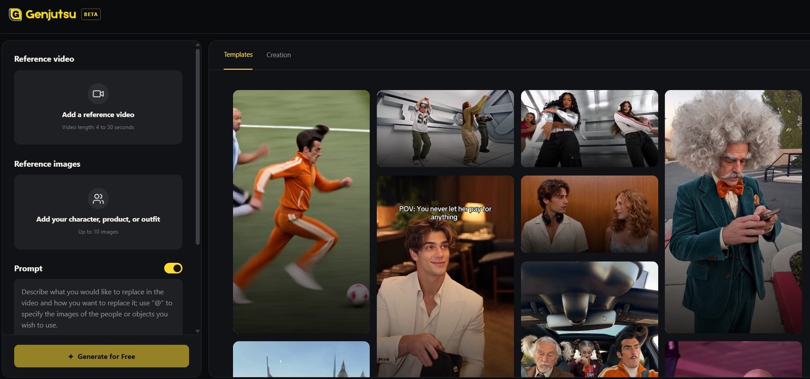
A familiar video can feel very different when an animated character takes over the main performance. A solemn knight joining a casual dance or a tiny robot delivering an exaggerated reaction creates an immediate contrast between subject and action. With genjutsu ai, creators can explore that contrast by combining reference footage with character images. The most interesting version gives the replacement a personality and a situation that make the familiar movement newly entertaining.
Build the Joke Around the Character
Start by naming the trait that makes your subject distinctive. A theatrical villain may overreact to a minor inconvenience. A disciplined robot may celebrate an ordinary task with surprising enthusiasm. A shy character may struggle with an overly confident entrance.
The reference should give that trait something to do. Choose movement that supports the personality or creates a deliberate contradiction viewers can understand.
Use an original character or visual assets you have permission to adapt. You can describe a broad character type without relying on a recognizable copyrighted figure. The creative value comes from the relationship between personality and performance, not simply a familiar name.
How to Recast a Trend with an Animated Character
Step 1: Find a Performance That Reads Clearly
Choose a recognizable action such as an entrance, dance, celebration, or reaction. Watch the full sequence and identify the exact moment that makes it work.
Look for visibility and manageable interactions. A character with a large helmet or short arms may present different visual challenges from the original performer. If the joke does not require complex contact with props, simpler footage can give you an easier first test.
Use source footage you have permission to adapt. Keep a record of the reference so it can be reviewed before publication.
Step 2: Prepare a Consistent Character Design
Select images that agree on the face, outfit, colors, and proportions. Mixing early concept art with a later design can introduce conflicting details.
Identify the features viewers should recognize throughout the movement. For a knight, that might be a broad helmet and blue cape. For a robot, it could be a square face and bright antenna.
Make those features visible in the references. A dramatic image that hides the face may express mood, but it may provide less useful information for a reaction-focused clip.
Step 3: Describe the Replacement Without Overloading the Scene
Upload your reference footage and character images, then identify the performer to replace in the prompt. Describe the central action and the design details that matter.
For example: replace the main dancer with the original knight character in the reference images, following the original dance and camera framing. Keep the blue cape and helmet recognizable.
This instruction describes the intended outcome, not a guaranteed result. Keep extra transformations limited until you have reviewed whether the character and movement work together.
Step 4: Watch the Timing Before Inspecting Frames
Review at normal speed. Does the new subject make the performance unexpected? Does the pause, turn, or reaction still happen clearly? Can you identify the character during the main moment?
Then inspect continuity. Check the face, accessories, costume, and proportions through changes in pose. Look closely at any contact with the ground, furniture, or another object.
If the action is suitable but the design changes, revise the visual inputs. If the character looks recognizable but the movement communicates the wrong attitude, choose a different performance rather than endlessly expanding the prompt.
Step 5: Add a Situation That Completes the Contrast
A short caption can connect the dramatic character to an ordinary problem. The knight celebrates finishing the laundry. The villain reacts to a cancelled appointment. The robot discovers a typo in its carefully prepared plan.
Choose a setup that the movement can communicate without a lengthy explanation. If the caption and action disagree, the viewer has to solve the scene rather than enjoy it.
Example Case: A Knight Celebrates Finishing the Chores
Imagine a fictional illustrator whose original knight is serious about every assignment, including household tasks. They want to adapt a celebratory dance format into a character-led joke. This is an illustrative scenario, not a reported result.
The illustrator selects footage with a readable celebration and uploads consistent knight images. The contrast is intentional: armor and a cape turn an ordinary victory dance into an exaggerated response to a small achievement.
They would review whether the helmet remains stable, whether the cape becomes confusing during the turn, and whether the main gesture still reads at normal speed. If the outfit obscures the joke, a slower or more open performance could be a better foundation.
A caption such as “Quest complete: folded the fitted sheet” gives the celebration a specific meaning. The creator could later explore the same personality in other suitable formats without repeating the exact joke.
Turn a Surprise into a Recurring Character Idea
Create a short list of everyday situations that fit the character before choosing more references. The knight might approach shopping, laundry, and making tea as important quests. This gives you several possible captions while keeping one personality. Match each situation to an available action instead of forcing every joke into the same dance or reaction.
Save the approved references and personality notes with the draft. Future adaptations should feel like the same character encountering new situations. That connection can make the account easier to understand than a collection of unrelated animated substitutions.
Unexpected casting becomes more useful when it reveals a recognizable personality. To explore an original animated subject within a familiar video format, genjutsu ai provides a reference-based starting point for combining a known action with a new character-led joke.

We Tested Every Popular AI Chatbot Like ChatGPT. Here’s How They Compare

How to Run an Instagram Giveaway Without Misusing Data

“Should I Order Medium or Large?” What Latex Sizing Advice Should Explain

Who Is Shameera? All You Need To Know About Charli XCX’s Mother

Who Is Gulliver Flynn Oldman? The Untold Story of Sir Gary Oldman’s Son

Meet Rosemary Turner: The Mother of Actor Callum Turner
-
Biographies9 months ago
Who Is Shameera? All You Need To Know About Charli XCX’s Mother
-
Biographies9 months ago
Who Is Gulliver Flynn Oldman? The Untold Story of Sir Gary Oldman’s Son
-
Biographies9 months ago
Meet Rosemary Turner: The Mother of Actor Callum Turner
-

 Biographies7 months ago
Who is Alexandra James? Inside The Life of Jeremy Clarkson’s Former Partner
-

 Blog5 months ago
AI Video for Social Media: How Small Brands Keep Up Without Burning Out
-
 Biographies9 months ago
Who is Todd McRae? Meet Tate McRae’s Father
-
 Biographies9 months ago
Who Is Daniel Mara? The Untold Story of Kate Mara’s Private Sibling
-
 Celebrity10 months ago
Who Is Peter Hernandez? The Real Story of Bruno Mars’ Father