Business
Why the First Hour of an Emergency Spill Matters Most for Australian Businesses

A spill that goes unmanaged for even a short time can change its own character entirely.
What starts as a contained incident on a factory floor becomes a stormwater problem, then a groundwater problem, then something considerably harder and more expensive to fix.
The window between a spill occurring and a proper response arriving is where outcomes are decided, and most businesses do not fully appreciate how narrow that window actually is.
Professional Emergency Spill Response exists precisely because that first hour is where the damage either gets controlled or compounds.
What happens in the absence of a fast response
Liquids move. That sounds obvious, but the implications of it tend to get underestimated during the chaos of an actual spill incident. A fuel or chemical release on a sloped concrete surface will find a drain. A drain connects to stormwater. Stormwater connects to waterways.
Each of those transitions happens faster than most on-site staff are prepared for, particularly when they are also managing injured personnel, calling supervisors and trying to identify exactly what has been spilled.
Untrained workers often make the situation worse without meaning to. Hosing down a chemical spill, for instance, dilutes it and spreads it further rather than containing it.
Flushing material toward a drain is an instinctive response to a mess, but it can turn a manageable site incident into a major environmental event.
The Difference Between Minor and Major Spills
Not every spill needs a specialist to sort it out, but that’s not to say they never do.
A tiny leak of non-flammable goo in a well-ventilated area, handled by someone who knows what they’re doing and has the right spill kit, is what most workplaces can deal with on their own.
But heres the thing – the line between nothing to worry about and a major crisis isn’t always clear when a spill first happens.
How much liquid is there involved is a factor, but so is how nasty the stuff is. Where it happened matters a lot too – a small bit of some really volatile chemical near a stormwater drain is a major incident, no matter how little there is.
When any of those things are up in the air, its better to err on the side of caution and assume its a big deal, and get the experts in ASAP.
What a Professional Spill Response Actually Entails
Dealing with an emergency spill is a multi-stage process, and each bit depends on the one that came before it being done properly.
Assessment & Identification
Before you even get to clean it up, you need to figure out what kind of goo you’re dealing with. Different chemicals need to be treated differently, so you need the right gear and the right people to know how to contain it, and where to get rid of it when you’ve finished.
Attempting to clean up an acid spill without understanding the material’s properties is genuinely dangerous for the personnel involved and can produce secondary reactions that worsen the situation.
Experienced response teams arrive with the capacity to identify substances quickly, assess volume and spread, evaluate proximity to drains and waterways, and determine what level of protective equipment the situation demands.
Containment
Containment stops the spread. Booms, absorbent barriers and bunding materials are deployed to create a physical boundary around the affected area.
This step is time critical because liquids are still moving while containment equipment is being set up. Speed and the right materials for the specific substance involved are both essential.
Cleanup and recovery
Once contained, the material needs to be physically removed.
This involves absorbents appropriate to the substance, vacuum equipment for larger volumes, and cautious handling to avoid secondary contamination of equipment, clothing and surrounding surfaces.
Nothing collected during this phase goes into general waste. It is all classified, contained and directed to appropriate treatment or disposal pathways.
Site decontamination
After the visible spill is cleared, affected surfaces are decontaminated.
For some substances this is simple. For others it requires specific neutralising agents and testing to confirm the area is genuinely clean rather than simply visually clear.
Why preparation changes outcomes
Businesses that have thought through their spill response before an incident occurs consistently manage incidents better than those that have not.
This does not mean predicting exactly what will happen. It means knowing which substances are on site, where the highest risk areas are, what containment equipment is available and where, and which specialist provider will be called when the situation exceeds internal capacity.
A spill response management plan is worth developing well before it is needed.
Having a 24-hour contact for professional Emergency Spill Response on hand is a basic operational precaution for any business handling chemicals, fuels or industrial liquids.
The cost of getting it wrong
Environmental contamination resulting from a poorly managed spill carries consequences that extend well past the initial clean-up cost.
Remediation of contaminated soil and groundwater is expensive and slow.
Damage to reputation in industries where the environmental performance is closely watched can affect client relationships and tendering prospects.
The costs associated with a managed response, by contrast, are predictable and contained.
Getting the right people on site quickly is almost always cheaper than managing the downstream consequences of a slow or inadequate response.


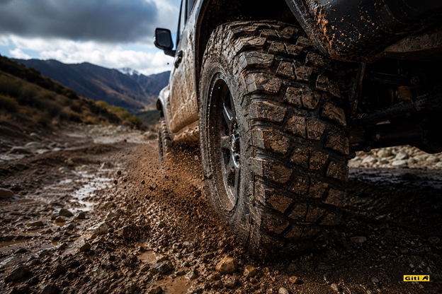
7 Real-World Use Cases
All terrain tires are built to handle more than just the morning commute, but they’re not right for every driver. Knowing exactly where they perform, and where they don’t, is what separates a smart upgrade from an expensive mistake. Here are seven real-world situations where an AT tire earns every kilometer.
1. Weekend Trail Driving and Light Off-Roading
This is the core use case all-terrain tires were designed for. Gravel trails, rocky fire roads, river crossings, compacted dirt, an AT tire handles all of it without requiring you to buy a dedicated mud-terrain tire that turns your daily drive into a noise nightmare.
The aggressive shoulder blocks and open tread voids that define an AT tire bite into loose surfaces and self-clean as you go. That means grip when the surface shifts under you, not just when it’s predictable.
Sidewall integrity is what separates a capable trail tire from one that fails. Reinforced sidewalls and upper sidewall protection are worth prioritizing here, trail debris doesn’t care about your tire’s marketing claims, and a sidewall puncture in a remote location is a far more serious problem than a tread puncture.
2. Daily Commuting on Mixed Road Surfaces
Most AT tire buyers are not hardcore off-roaders. They drive to work on sealed roads five days a week, then take the truck out on a gravel road or rural property on weekends. That’s exactly the split an AT off road tires is designed to manage.
The key is balance. A well-engineered AT tire prioritizes on-road comfort and quietness without sacrificing the off-road capability that makes it worth buying. You don’t want a tire that punishes your weekday commute just to handle a weekend trail.
For this use case, tread noise is the spec to watch. More aggressive tread patterns generate more road noise at highway speeds. If your commute involves significant motorway time, look for AT tires that specifically engineer for noise reduction alongside off-road grip.
3. Unpaved Rural and Farm Roads
Loose gravel, dusty red clay, seasonal mud patches, compacted dirt driveways, these surfaces destroy all-season tires over time. They are exactly what AT tires are engineered to shrug off.
Farmers, rural property owners, and anyone whose access road changes character with the weather need a tire that doesn’t require swapping out seasonally. An AT tire’s wider tread voids clear debris continuously, while its reinforced construction resists the slow punctures that gravel roads serve up.
This is a long-term cost argument as much as a performance one. All-terrain tires on a rural route typically outlast all-season tires on the same surface because they were built for what the road is actually doing to them.
4. Rainy Season and Wet Condition Driving
AT tires handle wet roads better than most drivers expect. The deep tread grooves and open tread design that give them grip on dirt work the same way on wet asphalt, they channel water out from under the contact patch aggressively, reducing aquaplaning risk.
This is especially relevant in tropical and subtropical climates where monsoon season turns roads unpredictable. An AT tire’s tread voids don’t fill up with water the way a fine-tread touring tire can. Grip stays more consistent across changing surface conditions.
The trade-off is worth being clear about: AT tires are not UHP wet-weather tires. Peak wet cornering at high speed belongs to performance rubber. But for everyday wet-road driving, particularly on surfaces that transition between sealed and unsealed, the AT tire’s drainage capacity is a genuine advantage.
5. Towing and Hauling with Trucks and SUVs
Towing shifts the load demands on your tires dramatically. You need stability under load, resistance to heat build-up during long highway runs, and traction when pulling away from a stop with a trailer attached. LT-rated AT tires are built for exactly this duty cycle.
The reinforced sidewalls that help on trails also help when towing. They resist side-load deformation during cornering when a loaded trailer is pushing back against the vehicle. Higher ply ratings in LT-metric AT tires increase load capacity and thermal stability compared to P-metric all-season options.
One check before buying: confirm your AT tire’s load index matches your vehicle’s GVWR when fully loaded. Not all AT tires are rated for heavy towing, verify the specs against your actual haul weight.
6. Overlanding and Long-Distance Adventure Travel
Overlanding demands more from a tire than any single use case. You need on-road efficiency across thousands of kilometers, off-road capability when the trail demands it, resistance to punctures in remote areas, and the durability to handle all of it without failure.
The self-sufficiency requirement of overlanding is what makes construction quality matter most. Thick sidewalls reduce the likelihood of an unrepairable sidewall tear in a remote location. High natural rubber content in the tread compound increases cut and chip resistance on sharp rock surfaces. These are failure-prevention specs, evaluate them seriously before choosing an overland tire.
Tread depth is also worth checking. Deeper tread provides longer service life on variable surfaces, which matters when you’re covering serious distance between service stops.
7. Mild Winter and Seasonal Driving Conditions
AT tires are not snow tires. That distinction matters and this article won’t paper over it. If you’re in a region with regular deep snow and sustained sub-zero temperatures, dedicated winter tires are the correct answer.
That said, all-terrain tires handle light to moderate winter conditions, fresh powder, slushy roads, frozen gravel better than all-season touring tires. The open tread voids that work in mud and loose dirt also provide bite in shallow snow.
Look for the Three-Peak Mountain Snowflake (3PMS) certification if winter performance is a priority. It confirms the tire has passed standardized testing for severe snow conditions and is not just a marketing claim. For drivers in climates with occasional winter weather rather than sustained winter, a 3PMS-rated AT tire can eliminate the seasonal swap while still providing meaningful traction over a standard all-season.
Which Giti AT Tire Fits Your Use Case?
Frequently Asked Questions
Are all-terrain tires good for highway driving?
Yes, with a caveat. Modern AT tires engineered for a 70/30 on-road/off-road balance treat highway performance as a design priority, not an afterthought. Expect slightly more road noise than a dedicated touring tire, but stable, comfortable motorway driving overall. The more aggressive the tread pattern, the more noise you carry onto the highway. Match the tread aggressiveness to your actual off-road demands.
Can I use all-terrain tires in the rain?
All-terrain tires perform well in the rain for everyday driving speeds. Their open tread voids channel water away from the contact patch effectively, reducing aquaplaning risk compared to fine-tread touring tires. They are not optimised for peak wet-cornering at high speed, that is the domain of performance all-weather or summer tires, but for mixed-surface and variable-weather driving, AT tires deliver solid, consistent wet traction.
How long do all-terrain tires last?
Under typical mixed-use conditions, well-maintained AT tires can cover 40,000 to 60,000 miles (approximately 64,000 to 96,000 km). Aggressive off-road use will reduce tread life. Regular rotation every 8,000 to 10,000 km and maintaining correct inflation pressure are the two most effective ways to extend service life. Under-inflation is the single biggest accelerator of premature AT tire wear.
What is the difference between the Giti4x4 AT70 and AT100?
The Giti4x4 AT100 is built for drivers who split their time roughly 70% on-road and 30% off-road balancing daily comfort with capable off-road performance. The Giti4x4 AT70 is for drivers with stronger off-road demands: it features a military-inspired tank-tread crown block design, 5mm reinforced sidewalls, and a chain curbing block system for upper sidewall protection. Choose the AT100 if your off-road use is occasional. Choose the AT70 if it’s serious.
Are all-terrain tires worth it for city driving only?
No. If you genuinely never leave sealed roads, an all-terrain tire is not the right tool. You will pay more, experience more road noise, and carry tread designed for surfaces you never use. For pure city driving, a quality all-season or all-weather tire is the better fit. AT tires earn their value when your driving regularly includes unpaved, loose, or variable-surface conditions.
Do all-terrain tires work in snow?
For mild snow and slush, yes. For sustained deep snow or ice, no, dedicated winter tires remain the safe choice for severe winter conditions. The open tread design of AT tires provides better snow traction than standard all-season touring tires. The Three-Peak Mountain Snowflake (3PMS) certification is the objective benchmark to look for, it confirms the tire has passed standardized severe-snow testing, not just a manufacturer claim.
The Bottom Line
All-terrain tires earn their place when your driving genuinely spans multiple surface types: mixed commuter and weekend off-road use, rural and farm roads, towing, overlanding, and variable-weather conditions. They are not the right answer for pure city commuters, serious mud, or sustained winter driving.
If your off-road use is occasional and on-road comfort matters, the Giti4x4 AT100 is the balanced call. If you push further into technical terrain and need the tire to hold up there, the Giti4x4 AT70 is built for it.
Explore the full Giti4x4 AT range at giti.com and find the tire that matches your actual driving — not the driving you think you do.

The 205/55r16 is a 16-inch, 55-series, 205mm wide tire fitted as original equipment on more compact and mid-size passenger vehicles globally than almost any other size. If your car came off a production line between 1995 and today and sits in the compact or family segment, there is a reasonable chance this is the size on your door placard. But being common is not the same as being simple. Drivers replacing a 205/55R16 still need to match the correct load index and speed rating, understand what tire category fits their climate, and avoid the common mistake of treating all 205/55R16 tires as interchangeable. This guide covers all of it.
The 205/55R16 Size Code, Decoded
The three numbers and one letter in a tire size code each carry a fixed technical meaning. None of them is a marketing label.
The 55-series aspect ratio is the detail that defines the character of this tire. At 55% of the 205mm section width, the sidewall height is just under 113mm, tall enough to absorb road imperfections and deliver genuine ride comfort, short enough to give the car reasonably responsive steering. It is the middle ground between the punishing low-profile sizes on sports cars and the soft, tall-sidewall fitments on older economy vehicles. That balance is a significant part of why this size became a default for family and commuter cars.
The 16-inch rim requirement is fixed. A 205/55R16 tire mounts only on a 16-inch wheel, within a recommended rim width of 5.5 to 7.5 inches. Running outside that width range affects the contact patch shape and shoulder wear distribution.
Why This Size Became the Global Standard for Everyday Cars
The dominance of 205/55R16 is not an accident. It is the outcome of several engineering and manufacturing decisions converging at the same point.
The weight-to-footprint match is near-optimal for C-segment vehicles. A 205mm contact width is wide enough to distribute the load of a 1,200 to 1,500 kg vehicle across a useful footprint without creating excessive rolling resistance. It is narrow enough to fit inside standard wheel arches without modification. Manufacturers designing a family hatchback or a compact sedan in the 1990s and 2000s consistently landed on 205/55R16 as the size that required no compromises in chassis design.
The 16-inch rim is the smallest diameter that provides adequate brake caliper clearance for modern front disc brakes on these vehicles. Going smaller forces brake engineering compromises. Going larger adds cost and unsprung weight without meaningful benefit for this segment. 16 inches sits at the economic and engineering sweet spot.
The 55-series sidewall is the ride comfort and cost balance point. A 45-series sidewall on the same width gives sharper handling but a firmer ride and higher wheel and tire cost. A 65-series gives better comfort but makes the car feel vague. 55 is where most drivers of family vehicles land without noticing, because the tire is doing its job without asking for attention.
The result is a size that fits a 6-inch rim (the most common and least expensive steel rim width in this diameter), works across a weight range of 900 kg to 1,600 kg, and requires no special alignment or suspension geometry. It is the size engineers reach for when the brief is reliable, cost-effective, and globally available.
Which Vehicles Use 205/55R16 as OEM
The following vehicles are among the most widely recognized OEM fitments for this size. Always verify against your specific vehicle’s door placard before purchasing, as variant-level differences within the same model can change the required size.
European and Asian hatchbacks
- Volkswagen Golf (Mk5, Mk6, Mk7 in standard trim)
- Volkswagen Golf GTI (select variants)
- Seat Leon (Mk2 and Mk3 standard variants)
- Skoda Octavia (multiple generations)
- Vauxhall/Opel Astra (Mk5 and Mk6)
- Peugeot 308 (Mk1 and Mk2 standard variants)
- Renault Megane (Mk3 and Mk4 standard variants)
Compact and mid-size sedans
- Honda Civic (multiple generations)
- Toyota Corolla (multiple generations)
- Mazda3 (Mk1 and Mk2)
- Hyundai Elantra (multiple generations)
- Kia Forte and Cerato (multiple generations)
- Ford Focus (Mk2 and Mk3 standard trim)
The pattern is consistent: high-volume, mass-market compact vehicles built for global markets where the combination of ride comfort, handling balance, and purchase cost matters most to the buyer.
Speed Rating and Load Index in 205/55R16
The letters and numbers that follow the tire size on a sidewall or product listing are not arbitrary. They carry legal and structural meaning that determines whether a tire is correct for your vehicle.
The most important rule: never install a tire with a load index or speed rating below the figure on your door placard. The door placard specifies the minimum for your vehicle’s weight and designed top speed. Downgrading either is a structural safety compromise, not a specification variance. It may also void your vehicle warranty and affect insurance coverage in the event of an incident.
For most vehicles using 205/55R16 as OEM, the door placard specifies 91H or 91V. The difference between H and V is 30 km/h of certified speed capacity (210 vs 240 km/h). For the vast majority of everyday driving, H is sufficient. If your vehicle specifies V as is common on GTI and Si performance variants. V is the minimum and you should not downgrade to H regardless of price difference.
Tire Categories Available in 205/55R16
All-Season Touring
All-season touring tires are the dominant category in 205/55R16 and the correct choice for most everyday drivers in temperate climates. They are designed to deliver consistent traction and handling across dry, wet, and light winter conditions year-round. Treadwear warranties on this category in 205/55R16 typically run from 50,000 to 85,000 miles, reflecting the longer-wearing compounds used in touring construction.
What all-season tires give up relative to a dedicated summer tire is grip precision at high temperatures and cornering load. For drivers who use their vehicle for commuting, errands, and occasional longer trips, that trade-off is entirely reasonable. For drivers who place their car in demanding cornering situations regularly, a dedicated summer tire will perform noticeably better in warm conditions.
Summer and Performance
Summer tires in 205/55R16 are available and appropriate for performance variants of the vehicles in this size, Golf GTI, Civic Si, and similar. They use softer, grippier compounds that maximize dry and wet grip in temperatures above approximately 7 degrees Celsius. Below that threshold, the compound stiffens and traction drops sharply.
If you drive a standard Golf or Civic primarily for commuting and weekend trips in mixed weather, a summer tire is not the right category. If you drive a performance variant and prioritize handling feel and wet braking over longevity and cold-weather usability, it is worth the consideration.
Winter
Winter tires in 205/55R16 are widely available across major manufacturers. The 55-series sidewall and moderate width of this size actually make it well-suited to winter use: the taller sidewall handles snow compression better than a low-profile, and 205mm is narrow enough to cut through light snow to reach the road surface. Drivers in markets with consistent sub-zero temperatures or regular snowfall should fit a dedicated winter set on a second set of 16-inch rims and run a summer or all-season set the rest of the year.
How to Choose the Right 205/55R16 Tire
The decision comes down to three variables: climate, use case, and OEM specification compliance. Work through them in order.
- Step 1 — Check the door placard: Confirm the required load index and speed rating. Every tire you consider must meet or exceed both.
- Step 2 — Identify your climate: Year-round temperate weather means all-season touring. Warm climate with no winter means summer. Sustained cold, snow, or ice means a dedicated winter set.
- Step 3 — Identify your use case: Daily commuter and family use points to all-season touring with the highest treadwear warranty you can find in the correct load and speed specification. Performance driving or a sporty variant points to a summer tire with a strong EU wet braking grade.
- Step 4 — Prioritize EU wet braking grade: Within the options that meet steps 1 to 3, the EU label wet braking grade (A to G) is the most safety-relevant differentiator. Prioritize A or B.
- Step 5 — Use treadwear warranty as a value signal: For all-season touring tires, a longer treadwear warranty reflects the manufacturer’s confidence in the compound’s longevity. 60,000 to 85,000 miles is the competitive range for quality options in this size.
Frequently Asked Questions
Is 91H or 91V the right specification for my car?
Check your door placard. It will specify the minimum speed rating. If it shows H, either H or V is acceptable, V meets or exceeds the H requirement. If it shows V, only V or higher is acceptable. H does not meet a V requirement. The practical difference for everyday driving is minimal, but the specification compliance is not optional.
Can I replace 205/55R16 with 205/60R16?
Technically possible but not straightforward. A 205/60R16 has a taller sidewall, producing an overall diameter of approximately 26.1 inches versus 24.9 inches for the 205/55R16. That is a 4.8% increase in diameter, outside the commonly accepted 3% tolerance. The result is a speedometer that reads lower than actual speed, potential clearance contact with the wheel arch liner, and a change in the steering response feel. Stick to 205/55R16 unless a fitment specialist confirms the alternative is clear on your specific vehicle.
How long should 205/55R16 tires last?
Real-world treadwear depends on driving style, inflation maintenance, alignment condition, and road surface. Under normal conditions, a quality all-season touring tire in this size with a 60,000 to 70,000-mile warranty will typically last 5 to 7 years for a driver covering 10,000 to 12,000 miles per year. The more important threshold is age: replace tires after 6 years from the manufacture date regardless of remaining tread depth. Find the manufacture date in the last four digits of the DOT code on the sidewall “1524” means week 15 of 2024.
Do I need to replace all four tires at once?
Not necessarily, but the strongest recommendation is to replace in axle pairs at minimum, both front or both rear together. Running mismatched performance tires on the same axle creates uneven traction side to side, which affects braking stability and handling balance. If your budget forces replacing only one tire, mount the new tire on the rear axle regardless of which corner is worn, and move the better of the two rear tires to the front. Never mount a single new tire on the front axle only.
What is the correct tire pressure for 205/55R16?
Correct tire pressure is set by the vehicle manufacturer, not the tire manufacturer. Check the door placard or the fuel filler flap on your specific vehicle. A common range for passenger cars in this size is 30 to 36 PSI, but the correct figure varies by vehicle, load, and whether the OEM fitment is standard load or XL. Do not use the maximum pressure printed on the tire sidewall, that is a structural limit, not a recommended operating pressure.
Summary
The 205/55R16 became the standard size for everyday compact and family cars because it solves multiple engineering requirements simultaneously: sufficient contact width for vehicle weight, comfortable sidewall height for ride quality, 16-inch rim compatibility for braking system clearance, and global manufacturing availability at competitive cost. Those qualities make it one of the most widely fitted tire sizes in the world and they also make it a size where the differences between tire options are real and worth understanding before you buy.
Match load index and speed rating to the door placard first. Choose tire category based on your climate. Use the EU wet braking grade to compare options within the compliant shortlist. For daily drivers prioritizing longevity, a treadwear warranty of 60,000 miles or above is the benchmark for this size.

Geneva is a city that deals in superlatives. Home to the world’s most prestigious watchmakers, the headquarters of dozens of international organisations, and a lakeside setting that has inspired painters and poets for centuries, it is a place where excellence is simply the baseline. When you visit Geneva, you do not settle for ordinary — and that philosophy extends to how you choose to travel.
A luxury car is not merely a convenience in Geneva; it is a statement of intent. It signals that you understand the city’s character, appreciate its finer details, and intend to experience it on its own terms. From the moment you arrive at Geneva International Airport and slide into a premium vehicle, the city opens up to you in a way that no taxi rank or rental queue could ever replicate.
Geneva: A City Built for the Discerning Traveller
Situated at the southwestern tip of Lake Geneva — one of the largest lakes in Western Europe — the city occupies one of the most spectacular natural settings on the continent. The Alps form a dramatic backdrop to the south, with Mont Blanc visible on clear days. The Jura mountains rise to the north. Between them, Geneva sits with a quiet confidence that is entirely its own.
The city is famously cosmopolitan. More than 40% of its residents are foreign nationals, drawn by the concentration of international institutions, private banks, and global corporations that call Geneva home. This international character shapes everything — the restaurants, the culture, the expectations of service — and it means that standards here are consistently, unapologetically high.
Why a Luxury Car Transforms Your Geneva Experience
Geneva rewards exploration, and the best of what it offers lies beyond the city centre. The lakeside Route de Lausanne stretches elegantly northward through some of Switzerland’s most exclusive addresses. The Route du Vignoble winds through the Lavaux vineyards, a UNESCO World Heritage Site perched dramatically above the lake. The mountain passes south of the city lead toward Chamonix and the Mont Blanc massif — among the most thrilling drives in all of Europe.
None of these experiences are truly complete from the back of a taxi or through the window of a tour bus. They require a vehicle that matches the occasion — one that handles the alpine curves with precision, insulates you from the road in total comfort, and arrives at every destination looking entirely at home.
For visitors who want nothing less than the best, luxury car rental geneva provides access to a carefully curated fleet of premium vehicles, from elegant executive saloons to performance-oriented sports cars, all ready to make your Geneva visit truly unforgettable.
The Best Drives From Geneva
| Destination | Drive Time | Highlight |
| Chamonix, France | 1 hour | Mont Blanc views, alpine scenery |
| Lausanne | 45 minutes | Lakeside drive, Olympic Museum |
| Lavaux Vineyards | 1 hour | UNESCO wine terraces above the lake |
| Annecy, France | 45 minutes | Canals, old town, alpine lake |
Exploring Geneva Itself
Within the city, a luxury car gives you the freedom to move between Geneva’s distinct neighbourhoods at your own pace. The Left Bank is home to the Old Town (Vieille Ville), with its narrow cobblestone streets, the magnificent St. Peter’s Cathedral, and the Maison Tavel — the oldest house in the city. The Right Bank hosts the Paquis district, the United Nations complex, and the iconic Jet d’Eau, the water jet that shoots 140 metres above the lake surface and has become the city’s most recognisable symbol.
The Rive Droite also encompasses the watch boutiques and jewellers of the Rue du Rhône — Geneva’s answer to the world’s most luxurious shopping streets. Arriving at any of these destinations in a premium vehicle simply feels right.
Practical Considerations for Driving in Geneva
- Geneva operates a controlled traffic zone in parts of the city centre — check local signage
- Switzerland uses a vignette system for motorways — most rental providers include this
- Parking in the city centre is limited; many luxury hotels offer private garage facilities
- Speed limits are strictly enforced: 50km/h in urban areas, 120km/h on motorways
- Switzerland is not in the EU but is part of the Schengen Area — no passport checks at most borders
Frequently Asked Questions
Is Geneva easy to drive in?
The city itself requires attentiveness due to tram lines and pedestrian zones, but roads are well-signposted and in excellent condition. Outside the city, driving is a pleasure.
Do I need a vignette to drive in Switzerland?
Yes, a motorway vignette is required for all vehicles using Swiss highways. The annual vignette costs around CHF 40 and is available at border crossings, petrol stations, and post offices. Many luxury rental providers include it as standard.
Can I drive from Geneva to France or Italy?
Yes. France is minutes away, and Italy is approximately two to three hours south through the Mont Blanc Tunnel or the Grand Saint Bernard Pass. Always confirm that your rental agreement permits cross-border travel.
What is the best time of year to rent a luxury car in Geneva?
Spring and summer offer the best conditions for both city driving and alpine excursions. Winter can be spectacular but requires winter-tyred vehicles for mountain passes — reputable luxury rental providers equip their fleets accordingly.
Is parking available for luxury vehicles in Geneva?
Yes. Geneva’s five-star hotels and most high-end restaurants offer secure parking. The city also has several premium private parking garages in the centre.
How far in advance should I book a luxury car in Geneva?
For peak season (June to August and the winter ski period), booking at least two to four weeks in advance is advisable to ensure the best vehicle selection.
Final Thoughts
Geneva has long been a byword for luxury, precision, and international sophistication. It is a city that expects nothing less than excellence — and a premium rental vehicle is the natural complement to everything it has to offer. Whether you are driving the lakeside boulevards at dusk, tackling a mountain pass toward Chamonix, or simply arriving in style at one of the city’s celebrated restaurants, the right car makes all the difference.
Geneva in style is not just a travel aspiration. In this city, it is simply the way things are done.

Pravi Celer: Complete Guide to Its Health Benefits, Science, Uses, and Modern Importance

Eo Pis The Ultimate Executive Intelligence System Transforming Enterprise Decision Making

Cevurı: The Ancient Anatolian Stew Redefining Slow Cooking and Sustainable Nutrition
Meet Rosemary Turner: The Mother of Actor Callum Turner
Who Is Shameera? All You Need To Know About Charli XCX’s Mother
Who Is Peter Hernandez? The Real Story of Bruno Mars’ Father
-
 Biographies4 months ago
Meet Rosemary Turner: The Mother of Actor Callum Turner
-
 Biographies4 months ago
Who Is Shameera? All You Need To Know About Charli XCX’s Mother
-
 Celebrity4 months ago
Who Is Peter Hernandez? The Real Story of Bruno Mars’ Father
-
 Biographies4 months ago
Who Is Alvin Martin? All About the Whoopi Goldberg’s First Husband
-
 Biographies4 months ago
Who is Todd McRae? Meet Tate McRae’s Father
-
 Biographies4 months ago
Who Is Daniel Mara? The Untold Story of Kate Mara’s Private Sibling
-
 Celebrity4 months ago
Who Is Monica Turner? All About the Life of Mike Tyson’s Former Wife
-

 Biographies2 months ago
Who is Alexandra James? Inside The Life of Jeremy Clarkson’s Former Partner